Wednesday 16 March 2011

Evaluation

Check out this SlideShare Presentation: my evaluation to my rock magazine

Sunday 13 March 2011

Double Page Spread Development 4

I now have added the subheading and the coloums of writing. I have put the main questions from the interviewer and the people of the band acctually speaking in black.

The next development will be my last development and final product. I will just have to add the picture and then the double page spread is done.

Double Page Spread Development 3

Here I have added the main heading to the page. I have made the word " dream " Stand out by making it a different colour so that it grabs the readers eye.

The next thing im going to do is add the whole writing. I will display this in coloums so it looks proffesional.

Double Page Spread Development 2

Here is my second page for my double page spread. I have added the information in the boxs however, I know that red on black isn't peoples first choice but I think in this situation I believe it works very well. Next I will add the Main Heading for the story on the page.

Double Page Spread Development 1

Here is my first development page for my double page spread. I have placed the nightmare logo in the middle of the page so it merges the two pages together. This method is conventional to most magazines. also I have placed to two boxs for information because I have found in most rock magazines they place information in smaller boxs.

Content Page Development 3

Here I have now added the subheadings and page numbers. There isn't much more that I can do, all thats left is to add a picture of the main band that are on the front cover and then that will be my final draft and my last development.

Content Page Development 2

I have now added the logo of the magazine at the very top of the page and now the title of the page in the same writing as the front cover. Also I have added titles to each of the sections so people know what there is in the magazine. Next im going to add the sub headings in the magazine so people know what pages are what stories on.

Content Page Development 1

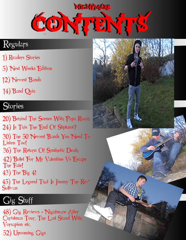
Here is my first development of my content page. I have set the page so it looks organised in to sections on the content page so that it looks proffesional. I have kept the colour scheme nice and simalar to what I said in my earlier posts.

Thursday 10 March 2011

Magazine Cover Development 3

Here I have added the subheadings and the imformation about the cost and date. The next thing I will do is add the main picture on the magazine to complate the cover.

Magazine Cover Development 2

Here I have changed the background like I said I would and I think that with this background the ain image will stand out alot more and that I brings out the ian splash alot more.
I am now going to add the sub titles and then after that I wil add the picture. Things may variey but I dont see this changing a whole much more.

First develepment on front cover

Here is what I have got so far, I have taken that background and edited around with it. I have had some critism which are mostly that ecause it goes from light to dark it is hard to read coming to the end of the spalsh, so i'm going to try a diffrent background to see if that look better.

Tuesday 8 March 2011

8th march 2011

Today I have tried to catch up with alot of work that I forgot to post. I have posted most of my research and ideas on to the blog, still got alittle bit or to do but should be ok. Made development on my magazine and should be ear finishing now.

Front cover 1st background Idea

My original idea for my front cover was to have the pic as the background aswell but these are just some ideas for my background. They are not 100% but just thought it wuld be a good idea to have some ideas just incase I change my mind.

I thought this would be a good background because it fllows the colours scheme I have chosen.

Colour Schemes

Here are a list of diffrenet colour schemes that I have ceated for which my magazine can folow by. I have chsen these colours on what I think a rock magazine most consits of.

I think I will be using either colour scheme 5, colour scheme 4 or colour scheme 2 as I think they will represent my rock magazine best.

Layout Ideas

Here I have created 3 diffrenet type of layouts that I could follow for my magazie layout. Here is the first on I have created, I think this would be great because it is nicely organised around the picture which would make my front cover look really proessional. Also it isn't to crowded so that it over taking the acctualy main image.


Here is the second layout I have made. I also like this layout as it doesn't over take or draw away any attention to the main image if anything it highlights the main image and in a rock magazine that is what I want and need.


Here is the third layout I have made and this one is so it focuses 100% on the main image. The main image will be a long shot of the band that is the main heading of the magazine. Also it is very organised with the sub heading just at the bottom of the page to the side of the image so the front cover will be alot more proffesional.

Magazine Names

Here are all the names that thought were suitable for my rock magazine. I tried to think of names which sounded heavy, nasty and some what rockish, this way the audience knew what the magazine was about. To help me decided what name I should have fr my magazine I tok a survey out of 20 people to see which one they liked best.
Here are the results of the survey I took:
Metal Destruction:5
Nightmare:7
Deathning:3
Louder:3
Destroyer:1
RnR:1
Chaos:0
The End:0

It is clearer that nightmare was the clear favourite that people wanted on my rock magazine. Since the audience picked this name I think it woud be ideol for me to have this title for my magazine.